The Complete Guide to Power BI Theme Generators
An in-depth comparison of the top Power BI theme generators, their features, limitations, and how they can transform your report design workflow.
Creating visually compelling Power BI reports is about more than just crunching numbers and organizing data—it's about delivering insights through intuitive, professional designs that engage users. Design is a critical component of Power BI development, influencing not just how a report looks but how effectively it communicates information. Great visual design balances clarity, usability, and aesthetics, ensuring that users can quickly interpret the data without distraction or confusion.
Yet, achieving this level of polish is easier said than done. One of the most tedious aspects of Power BI development is editing JSON theme files. Whether it's adjusting data colors, tweaking font sizes, or refining the spacing, the process often involves hours of trial and error: changing a property in the JSON, reloading the file, and checking if the intended style was updated. It's an exhausting and inefficient workflow.
This is where theme generators come in. A good theme generator should go beyond simply allowing users to tailor a theme file. It should empower users to create professionally designed reports with minimal effort, eliminating the frustration of manual JSON editing. By simplifying the application of themes, these tools save time and make high-quality design accessible to all Power BI users, regardless of their technical expertise.
1. Power UI
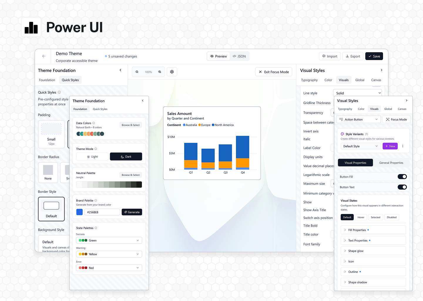
Power UI stands as the pinnacle of Power BI theme generation, offering actual software that transforms theme creation from a tedious chore into an intuitive, enjoyable experience. Built for both beginners discovering the world of Power BI design and seasoned professionals demanding precision control, Power UI delivers an unmatched combination of power, flexibility, and ease of use.
Real-Time Preview
Experience the game-changing power of real-time theme preview through Power BI Embedded integration. Unlike other tools that rely on mockups or static representations, Power UI shows you exactly how your theme looks on actual Power BI reports. Every adjustment you make—from subtle color shifts to major structural changes—appears instantly in the live preview. What you see is precisely what you get, eliminating the endless cycle of export, import, and test that plagues traditional theme development.
Full Customization
Power UI introduces something revolutionary: complete control over every single theme property in Power BI. For the first time ever, you have access to every color, every style, every minute detail through an intuitive interface. Create themes that truly represent your brand with custom backgrounds, wallpapers, and styling for every property imaginable. The thoughtfully designed state-driven properties system lets you configure default, hover, and pressed states with simple toggles—no JSON expertise required.
Quick Customizations
Beyond comprehensive control, Power UI excels at making common tasks effortless. Toggle between light and dark modes with a single click. Adjust border styles, fine-tune padding, and customize background styles through intuitive controls that update your entire theme instantly. The interface anticipates your needs, putting the most frequently used adjustments at your fingertips while keeping advanced options easily accessible.
Focus Mode
Focus Mode represents a breakthrough in precision theme design. View any visual up close, giving you pixel-perfect control over every element. Need to undo a change? Simply click to clear any property. The interface is intuitive, responsive, and—dare we say—actually fun to use. Focus Mode even lets you resize visuals in real-time, showing exactly how your theme adapts to different sizes and shapes. It's the level of control professional designers have always wanted, delivered in an interface anyone can master.
Style Variants (Style Presets)
Here's where Power UI achieves something no other tool has managed: it's the first and only theme generator that lets you create and customize style presets through an intuitive interface. Create unlimited variants—different button styles, KPI configurations, company-specific visual treatments—all without touching a single line of JSON. Design multiple style presets for different use cases and access them directly in Power BI. This groundbreaking feature opens up possibilities that were previously impossible without deep technical knowledge.
JSON Preview
While Power UI's interface eliminates the need to work with JSON directly, we believe in complete transparency. The JSON Preview feature shows you the exact code that creates your theme file—clean, efficient, and following official schema guidelines. When working with style variants, toggle to computed styles to see precisely which properties are inherited from your default visual style. No mysteries, no guesswork—just complete visibility into your design system for those who want to understand what's happening under the hood.
Collaboration Features
Power UI transforms theme management from a solo endeavor into a collaborative process. Real-time shared theme libraries keep your entire organization aligned with consistent branding. The public theme sharing feature lets you contribute to and benefit from the Power UI community's collective creativity. And with theme import functionality, you can bring themes from any source into Theme Studio for enhancement and customization.
Revolutionary Icon System
The updated Power UI icon library takes report design to new heights with over 1,500 clean, consistent icons accessible directly from powerui.com. But these aren't just static images—the dynamic URL system means no hosting hassles, just copy and use. The true power emerges with dynamic color control, enabling sophisticated DAX integration. Create formulas that automatically update icon colors based on KPI values—green for success, red for attention needed—all responding dynamically to your data. Export the full icon list as a dataset in Power BI for complete programmatic control over your visual indicators.
Power UI includes a comprehensive dashboard design e-book featuring hundreds of real-world examples and best practices, all demonstrated within Power BI's familiar interface. Since its launch in 2023, Power UI has received new features and enhancements nearly every month, driven by user feedback and our commitment to excellence.
Power UI isn't just the best Power BI theme generator available—it's a transformative tool that elevates what's possible in Power BI design. By combining unmatched customization capabilities, intuitive interfaces, and innovative features like style presets and real-time preview, Power UI empowers every user to create stunning, professional themes that make data beautiful.
2. Themes.pbix by POINT
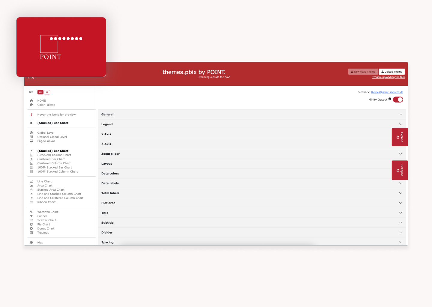
Themes.pbix by POINT is a theme generator created by POINT, an IT consultancy and software development agency based in Hamburg. It offers a free and straightforward approach to Power BI theme generation. While it lacks some of the bells and whistles of other tools, it provides a functional user interface for working directly with the JSON schema.
One standout feature of this generator is its dropdown interface for managing state-driven properties, such as the hover, pressed, and default states of buttons. These state properties are presented as simple dropdown menus, making them much more accessible than tools like PowerBI.Tips, which requires users to somehow know what to enter in the $id fields to assign values to different states. Unlike other tools, which often overlook this level of granularity, Themes.pbix provides an intuitive way to edit these properties without delving into the raw JSON.
The tool's ability to generate a color palette from a primary color is both simple and effective. This feature automatically creates harmonious color variations, saving users time and effort in designing cohesive themes. While it may not be as advanced as dedicated color tools, it's a valuable addition that aligns well with the needs of Power BI users. Additionally, the inclusion of icon upload functionality allows users to add their own icons to the theme, expanding creative possibilities for conditional formatting and custom visuals.
However, like similar tools, Themes.pbix struggles with making property customization clear. While the dropdowns offer a structured way to edit the JSON schema, it's often unclear what each property actually affects. Users frequently need to rely on trial and error to determine how a change impacts the visual style. The tool also lacks robust documentation and live preview functionality, which means users can't see changes in real time.
While the site mentions regular updates with new features, the tool hasn't been updated in over a year, and it's unclear if new features are being added or what they might be. Additionally, calling this approach "theming outside the box" might be a bit of a stretch, as this theme generator delivers exactly what you'd expect from a conventional JSON editing interface—firmly inside the box of traditional theme generation methods.
Important limitation: Like most theme generators, Themes.pbix doesn't support customizing style presets, which control the default styling for charts, tables, and other visuals. This means users must still manually edit JSON files for comprehensive theme customization beyond basic properties.
3. PowerBI.Tips
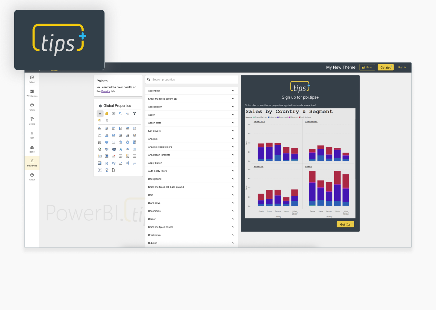
PowerBI.Tips was created by Michael Carlo and Seth Bauer. It offers a user-friendly interface for creating and editing JSON theme files through a series of dropdowns and customizable options.
One of the strongest aspects of PowerBI.Tips is its palette creation tool. The intuitive interface allows users to generate color palettes with a color wheel or gradient, making it simple to experiment with and choose harmonious colors. This feature is completely free and is a great resource for anyone looking to refine their color choices. The live preview feature, available in the paid tier, is also a valuable addition that enables users to see how their theme settings impact Power BI visuals in real time, though there are some challenges with understanding which properties correspond to specific elements.
PowerBI.Tips also offers a library of icons designed for conditional formatting. While these icons are not available for download as standalone assets, their consistency and customizability in terms of color make them a helpful feature. However, one significant limitation is how the tool handles state-driven properties like button states. While you can enter states like "default" or "hover" in the $id field, this requires knowing which state names to use—and critically, you can only enter ONE state at a time. This makes it impossible to properly customize simple interactions like button states, and completely rules out customizing more advanced visuals like the button slicer or advanced card that require multiple state configurations.
The platform includes some features that feel misaligned with modern Power BI design principles. The gallery of community-created decorative backgrounds ("scrims") can be downloaded or customized, but this aligns poorly with best practices for Power BI design, which prioritize simplicity and clarity over decorative elements. The wireframing tool and "Visuals AI" feature seem underdeveloped and don't significantly enhance the user experience. Additionally, the lack of clarity around which properties affect specific elements is a major drawback, making the design process more trial-and-error than it needs to be.
Critical limitation: PowerBI.Tips, like other theme generators, lacks support for customizing style presets. This significant gap means that users cannot define default styling for charts, tables, and other visuals through the interface, requiring manual JSON editing for truly comprehensive themes.
4. BIBB Theme Generator
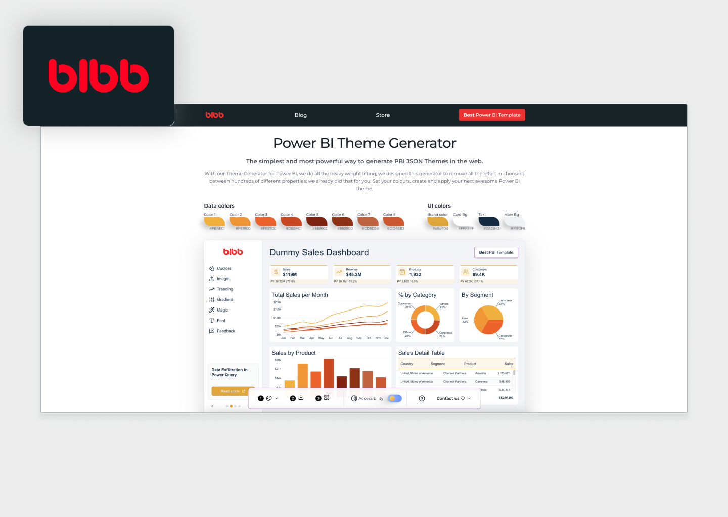
The BIBB theme generator was created by Oscar Martínez Valero and Diana Maier. While their slogan of "The simplest and most powerful way to generate PBI JSON Themes in the web" is a bit of a stretch, Bibb does offer some neat features in a straightforward and accessible package designed to simplify the process of customizing Power BI themes. The tool is free to use after signing up for their mailing list, and they also sell a reporting template for $55 on Gumroad.
Bibb's simplicity is one of its key strengths, allowing users to make quick adjustments to essential aspects like data colors and background settings without getting bogged down in technical details. One standout feature is its ability to toggle between light and dark mode—this functionality is unique among Power BI theme generators and is a huge time-saver for users who want to ensure their designs work well in both appearances. Additionally, Bibb is one of the few tools that actively checks for WCAG compliance, ensuring that color combinations meet accessibility standards, which is an excellent feature for users focused on creating accessible reports and dashboards.
More importantly, it's not possible to customize features outside of colors and fonts. All the styles are baked into the theme, meaning you have to use a different theme generator if you want to customize borders, padding, or other styling elements. If you really love the BIBB style, then this is the tool for you—but for most users seeking comprehensive customization, its limitations will quickly become apparent. BIBB also creates YouTube videos on Power BI design and development.
Notable limitation: Beyond the inability to customize anything except colors and fonts, BIBB also lacks support for style presets—a critical component of Power BI themes that defines default styling for charts and other visuals. This double limitation severely restricts the tool's usefulness for creating truly customized themes.
Feature Comparison
| Feature | Power UI | PowerBI.Tips | BIBB | Themes.pbix |
|---|---|---|---|---|
| Live Power BI Preview | ||||
| Light/Dark Mode | ||||
| Custom Color Palettes | ||||
| Neutral Palette System | ||||
| Token-Based Architecture | ||||
| Icon Library | ||||
| Quick Style Controls | ||||
| Figma Integration | ||||
| Cloud Icon Hosting | ||||
| Regular Updates | ||||
| Theme Sharing | ||||
| Example Reports | Paid | |||
| Spacing Grids | ||||
| Style Presets | ||||
| State Palettes | ||||
| Full Theme Customization | ||||
| Team Management | ||||
| Professional Base Theme | ||||
| Lifetime Updates | ||||
| Import Themes |
Ready to transform your Power BI reports?
Join thousands of professionals using Power UI to create stunning themes in minutes.
Get Started